Creating the Perfect Dining Room Atmosphere
The dining room serves as a central gathering space in many homes, whether for holiday feasts or casual weekend brunches. Selecting the right paint color is crucial in setting the ambiance for these cherished gatherings. Therefore, understanding which colors to embrace and which to avoid can significantly enhance the dining experience for guests and hosts alike.
Tips for Choosing the Perfect Dining Room Paint Color
When it comes to selecting a paint color for your dining room, there is an opportunity to venture away from the usual neutral tones. As this space might not be where you spend the majority of your time, it allows for more experimentation with colors. Here are some tips to guide your color selection process.
Don’t Be Afraid to be Bold
Many homeowners may shy away from vibrant colors, preferring to adhere to a monochromatic palette. However, the dining room is an area ripe for expression. As Amy Krane, an experienced color designer, notes, a colorful dining room can create a lively atmosphere that enhances gatherings. Options such as dark hues, intricate wallpapers, or a multi-colored palette can successfully draw guests in and keep the environment engaging.
Keep the Colors Cozy
Unlike other areas of your home where you may prioritize making the space appear larger, dining rooms thrive on intimacy. According to color designer Michelle Marseny, rich and saturated shades contribute to a warm atmosphere. Consider colors like deep purples, burgundies, and rich neutral tones that evoke an invitation to linger over meals and conversation.
Consider the Color of Adjacent Rooms
When selecting the dining room color, it is crucial to maintain visual continuity with adjacent areas, especially in open-concept layouts. Krane advises ensuring that your choices harmonize with the adjoining rooms. For instance, pairing a dark purple dining room with a light blue living space that shares a hint of purple can create a cohesive flow throughout your home.
Think About Lighting
The functionality of your dining room should also inform your color choices. If you regularly host dinners or plan to cultivate a lively environment for entertaining, the room must accommodate effective lighting. Testing the proposed colors under different lighting fixtures can help ensure that the shade enhances the atmosphere you seek to create.
Dining Room Paint Colors to Avoid
Selecting inappropriate colors can spoil even the most thoughtfully designed dining room. For an optimal dining ambiance, experts suggest steering clear of the following hues:
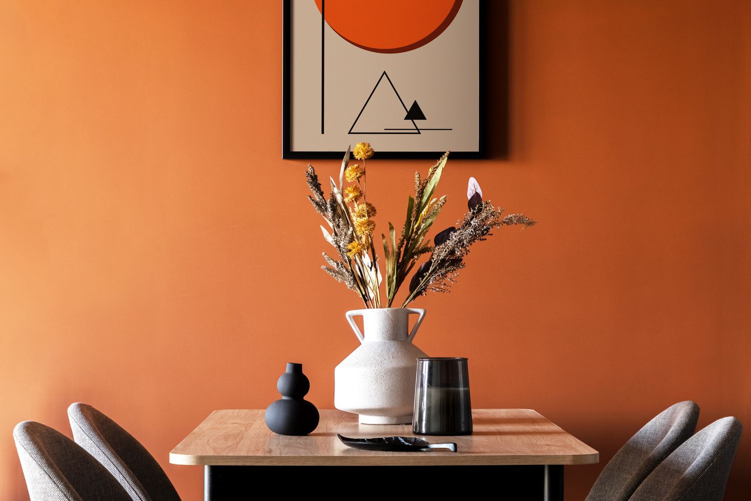
“Fast Food” Colors
Colors commonly found in fast-food establishments, such as bright reds, oranges, and yellows, may stimulate appetite but also encourage quick dining and departure. Marseny mentions avoiding these colors, as they do not foster the welcoming atmosphere one hopes to achieve in a dining setting.
Pure White
While a bright white can provide a clean and modern look, it may also create a stark or clinical feel, which is not desirable for a dining room. Unless there are multiple art pieces to provide visual interest, white walls can detract from the warmth intended for this gathering space.
Bland Neutrals
Neutral colors like beige and gray can render a dining room unremarkable. Krane highlights the risk of these shades blending into the background, losing their potential as a vibrant backdrop for dining experiences. Given that dining rooms often feature fewer decorative elements than other areas, the wall color plays an essential role in unifying the space.
Expert-Recommended Dining Room Paint Colors
Experts offer a variety of color recommendations ideal for enhancing the dining experience. These colors can create an inviting and warm environment, essential for social gatherings. By adhering to some of these suggestions, you can craft a space where guests feel comfortable and engaged.
Conclusion
The right paint color can transform your dining room into a warm and inviting space, perfect for gatherings. By considering bold and cozy tones while avoiding stark whites and fast-food colors, you can create an environment that encourages lingering conversations and memorable meals. The perfect dining room practically begs for guests to sit down and enjoy what it has to offer.
FAQs
What is the most recommended color for a dining room?
Colors like deep purple, burgundy, rich neutral blues, and greens are often recommended for a dining room to create a warm and inviting atmosphere.
Which colors should I avoid in my dining room?
Avoid bright reds, oranges, yellows, pure white, and bland neutrals like beige and gray, as they can create an unwelcoming or hurried dining experience.
How do I choose a paint color that works with my open-concept space?
Consider the colors of adjacent rooms and aim for a cohesive flow. Picking shades that connect can unify the overall aesthetic when moving from one space to another.
Can I use a bright color in a small dining room?
Yes, bright colors can work in smaller spaces, but ensure that the color adds warmth and interest without overwhelming the room. Testing the paint under different lighting can help gauge its effect.
Exploring the Allure of Benjamin Moore’s Herb Garden Color
Benjamin Moore’s Herb Garden is an enchanting hue that speaks to the beauty of natural landscapes. This color is characterized by its vibrant yet soothing green tones, making it an ideal choice for various interior applications. It’s perfect for those looking to infuse their spaces with a touch of tranquility while evoking the freshness of a garden. With the rise of biophilic design trends, incorporating nature-inspired colors is more than just a stylistic choice; it reflects a yearning for connection to the natural world.
Color Compatibility and Application
When selecting a paint color, it is crucial to consider its compatibility with various furnishings and decorative elements. Benjamin Moore’s Herb Garden looks stunning when paired with light-colored dining furniture or neutral-toned decor. By providing a bold yet warm backdrop, it draws attention to the chosen furniture pieces, making them stand out while also harmonizing with the surrounding environment. Additionally, pairing this color with bold wallpaper or contrasting accents can create a dynamic and interesting space, appealing to those with a creative eye.
Contrasting Alternatives: Sherwin Williams Sea Salt
While Benjamin Moore’s Herb Garden offers a striking visual, alternatives like Sherwin Williams Sea Salt render a softer and subtler vibe. This color features slightly muted tones that breathe life into dining spaces without overwhelming the senses. It’s particularly suitable for those seeking a more relaxed atmosphere that still brings in organic elements. Integrating colors with varying depths, such as Sea Salt, can create a sophisticated browsing experience in dining rooms and other areas of the home.
Exploring Depth with Evergreen Fog
Another noteworthy option is Sherwin-Williams Evergreen Fog, a neutral jade green that provides a sense of calm yet stands out against natural wood finishes. This is particularly relevant in spaces where wooden elements play a significant role, as it complements rather than competes with these accents. Utilizing Evergreen Fog alongside Benjamin Moore’s Herb Garden can cultivate a rich and inviting atmosphere, ideal for shared meals and gatherings.
Bold Statements with Benjamin Moore’s Hudson Bay
For those wishing to make a more dramatic statement, Benjamin Moore’s Hudson Bay is a deep navy blue that brings sophistication and depth to dining rooms. This color captures the serene essence of the ocean, evoking feelings of calmness while maintaining an air of elegance. It works exceptionally well in spaces enhanced by chandelier lighting, as the interplay of light and shadows creates a captivating ambiance that encourages conversation and connection among guests.
Warmth without the Red: Benjamin Moore’s Plum Raisin
If you prefer warmer tones without venturing into the overly vibrant spectrum of reds or yellows, consider Benjamin Moore’s Plum Raisin. This unique hue merges deep red and purple tones, offering warmth without the frenetic energy that brighter shades may convey. Such colors create a cozy environment, making it an excellent choice for dining rooms where intimate gatherings of family and friends occur.
A Trendy Twist with Boothbay Gray
Another distinctive option from Benjamin Moore is Boothbay Gray, a cool gray with blue undertones that shifts subtly throughout the day as natural light interacts with it. This color adds an element of sophistication and depth, while also keeping the space feeling fresh and dynamic. By integrating this shade alongside warmer tones or rich colors, homeowners can achieve a balanced palette that feels both grounded and invigorating.
Conclusion
Choosing the right color for your dining room or any living space can greatly influence the atmosphere and overall aesthetic. Colors like Benjamin Moore’s Herb Garden and its alternatives not only enhance a room’s visual appeal but also contribute to an inviting and peaceful ambience. Whether you opt for a bold navy or a muted jade, the key lies in finding a shade that resonates with your personal style and complements your existing decor. By considering various color combinations and the emotional responses they elicit, you can create a space that reflects beauty and tranquility.
FAQs
What are the defining characteristics of Benjamin Moore’s Herb Garden?
Herb Garden is a vibrant yet soothing green that evokes feelings of tranquility and connection with nature, making it perfect for spaces needing a fresh, organic touch.
How can I combine Herb Garden with other colors?
Herb Garden pairs well with light-colored furniture and can be combined with bolder wallpaper for contrast. Neutral tones also complement it, while colors like teal or deeper greens can create a more layered look.
What makes Sherwin-Williams Sea Salt a good alternative?
Sea Salt offers a softer, more muted hue that provides a calming effect, making it ideal for minimalistic or serene spaces while still adding a natural vibe.
Is Hudson Bay suitable for small rooms?
Yes, while Hudson Bay is a deep color, it can add dramatic elegance to small rooms when balanced with lighter furnishings and thoughtful lighting.
Can I use Plum Raisin in modern decor?
Certainly! Plum Raisin can warm up modern spaces without overwhelming them, providing a rich accent that enhances contemporary designs.